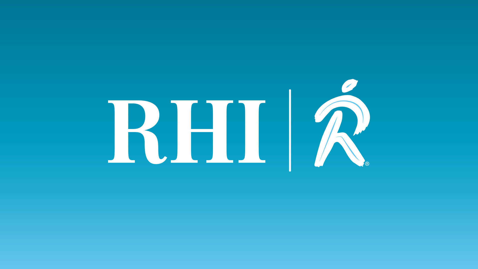
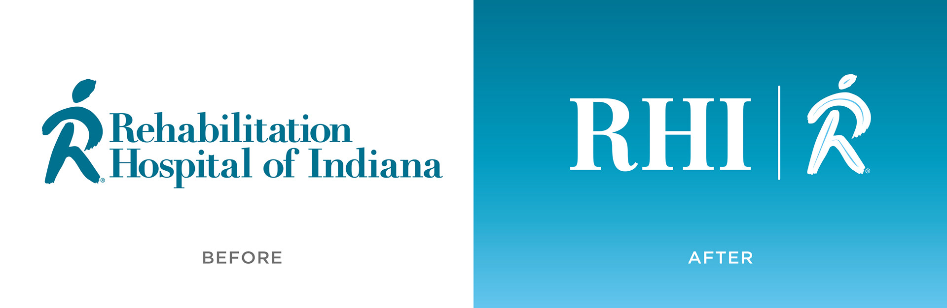
Rehabilitation Hospital of Indiana wanted to update their existing brand. Their logo looked dated and they needed something fresh. Their patients and other entities that they worked with have always referred to them as RHI so I chose to show their name in abbreviated form.
They opted to stay with their stylized "R". I reduced the size of the "head" above the R and added an inline element to give it fresh appeal. The new "R" was moved to the right to symbolize forward movement and progress. The abbreviated "RHI" would be used in most instances, but a full written version was also created for certain situations. A gradient using updated brand colors was also used to update the look.

RHI is a leader in Rehabilitation and wanted to reflect a data-driven style for their overview sheet below. The update of their current pieces is ongoing.